
When redesigning or redecorating your office, one of the key decisions you’ll have to make is choosing an office colour scheme. On the surface, this decision may seem to be all about aesthetics or company branding, but the real impact of your office colours actually goes deeper than this.
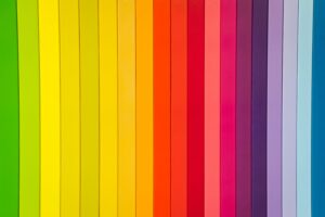
According to colour psychology, all colours evoke different emotions, moods and behaviours. In fact, when assessing an environment, colour is one of the first things that our subconscious minds notice and react to. For example, we’re all familiar with the idea that red connotes boldness, passion and romance, whereas blue can evoke feelings of calm, stability, hope or even sadness depending on the hue and placement.
In fact, LiveScience stated that blue is consistently ranked as the most popular colour in the world, and it’s also one of the most prominent colours in office spaces. But why is blue such a popular colour for offices, and should you be painting your office space blue? Let’s take a closer look at colour psychology and the five main benefits of using Pantone blue shades in your office design.
Colour psychology
Colour psychology is the study of how different colours affect how we think, feel and act. We’ve all noticed how different colours and environments have made us feel throughout our lives. For example, when we stand in a lush green meadow, we feel calm, refreshed and energised. When we stand on the shore of an ocean or lake, the meeting of the blue waves with the endless blue sky will make us feel peaceful, reflective and secure. And when we see bright yellow flowers in the spring, we feel cheerful and energetic.
Based on your own experiences, you’re probably familiar with the emotions and behaviours that different colours can evoke. However, let’s quickly go through a quick summary for each major colour so we’re on the same page:
Blue
Blue is commonly regarded as the world’s most popular colour. As a primary colour, blue evokes a strong response and can even conjure various emotions, which can depend on the shade of blue, the amount of blue, other colours nearby and your starting mood.
Blue is a cool-toned colour that creates a sense of calm, stability, focus, strength and consistency, which can improve our mental well-being and even make us more efficient and productive. In addition, blue is commonly associated with positive feelings of hope, spirituality and prosperity, but it can also evoke feelings of sadness and depression in some cases depending on the tone.
Red
As another primary colour, red also creates strong feelings. Red is a bold, striking colour that conjures feelings of excitement, daring, passion, love and courage. However, red can also signal danger.
Yellow
Yellow is commonly associated with feelings of happiness and optimism. Yellow environments can make people feel energetic, social and cheerful. On the other hand, too much yellow can be stifling and overpowering, so as with every colour, it’s imperative to use tonal colours.
Green
Through its close associations with nature, green connotes health, growth, renewal and vitality. Green can help people feel peaceful, energised and refreshed, although it’s also sometimes linked to feelings of jealousy. Again, tones and the amount of surface area being covered are key here. Carefully testing small areas is a good idea, before committing to lots of colour in a single large space.
Purple
Purple is often associated with creativity, imagination and wisdom, but in addition to these cognitive benefits, purple is often linked to wealth, royalty and luxury.
Pink
Pink is a warm and comforting colour. As the mixture of red and white, pink takes elements from both and can evoke a sense of love, purity, innocence and sweetness.
Orange
As another warm colour, orange inspires cheerfulness, confidence and friendliness. Orange is also energetic and enthusiastic.
Grey
Although grey can be commonly associated with negative feelings like boredom (which is why grey isn’t regarded as the best colour for office spaces), grey also symbolises neutrality, modesty and moderation.
White
White often symbolises innocence, purity and cleanliness, but again, it can also evoke feelings of boredom and emptiness. White can be a great colour for a minimalist office design, but it’s a good idea to break it up with accent colours or interesting features and textures to prevent the space from looking too cold and clinical.
Source: Pantone
Benefits of using Pantone blue for your office space
As mentioned above, blue is one of the most popular office colours around the world, and one of the most popular colours in general. To discover why this is the case, let’s discuss the many benefits of Pantone blue shades, which make it one of the best office colours for all kinds of companies.
1. Productivity
It’s been consistently shown through research that blue can increase concentration, efficiency and productivity. As a cool-toned colour, blue makes people feel calmer and more secure by reducing feelings of anxiety and stress. By improving people’s mental state, the colour blue can therefore increase productivity by making it easier for people to enter a state of calm focus.
However, overwhelming your office with blue to increase productivity can have the opposite effect. Too much blue could be too overstimulating and tiring, evoking feelings of lethargy and sadness. Instead, it’s better to balance your use of blue and use more of it in areas where you want to encourage quiet, calm concentration, such as meeting rooms or ‘deep work’ spaces for individual working.
2. Calmness
As mentioned above, the colour blue is strongly associated with feelings of calmness and mental clarity. In addition to helping people focus on their work, this sense of calm is vital for your employees’ mental health. All jobs can come with stressful days, but it’s so important that this stress is balanced with calmer moments when people can recover.
Using blue in your office space can encourage relaxation and help to avoid burnout. Of course, your office colour scheme can’t replace an effective workplace strategy for dealing with stress and burnout, but using blue throughout your office (and especially in a designated relaxation room or breakout area) can be a very helpful addition.
3. Reconnecting with nature
Although green is often regarded as the colour most strongly associated with nature, blue can also help people reconnect with the Earth. Around 70% of the Earth’s surface is covered in water, giving rise to the nickname the ‘Blue Planet’. Therefore, blue shades can make us think of the natural world, including rivers, lakes, oceans and the sky above. This connection to nature soothes us and decreases feelings of stress.
In the workplace, using blue can therefore encourage good mental health and decrease feelings of burnout, isolation and depression. To really emphasise this connection to nature, try using elements of blue and green in your office space, or add green plants to improve the decor.
4. Reliability
Blue is commonly linked to a sense of reliability and stability. This makes blue one of the best office colours, especially if you frequently invite clients into your office space. According to colour psychology, blue will evoke feelings of security and stability, which means that these clients will subconsciously associate your business with positive traits like reliability. If you want to improve your business’s reputation and authoritativeness in your industry, simple changes like an office refurbishment could make a real difference if you think carefully about your colour scheme.
5. Creativity
Finally, blue can spark creativity in your office space. This is because blue is linked to mental benefits like focus, mental clarity and hope. Again, creating a space that promotes good mental health is extremely valuable for your business, as your employees will feel more motivated, efficient and productive. This will allow them to achieve a deeper level of focus, which can lead to more effective collaboration that produces creative and insightful solutions to issues facing your business.
Blue is also closely related to purple, which is associated with wisdom, creativity and imagination. If you want to specifically encourage creative thinking, it may be a good idea to use elements of tonal blues and purples within your colour scheme. Or, you could choose a blue-toned purple as your main office colour, such as Pantone’s Very Peri shade. This was the Pantone Colour of the Year in 2022.
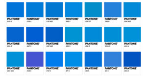
What Pantone shade of blue should you use?
Using different shades of blue can help you enhance different effects, such as stability, creativity, relaxation or focus. A great all-round shade is Pantone’s Classic Blue, which was the Pantone Colour of the Year in 2020. This is a dark blue that can work well as an accent colour in your office space.
If you want to focus on blue’s calming effects, you should opt for a light blue like Pantone Sky Blue or Delicate Blue. On the other hand, vibrant azure blues like Pantone Hyper Blue or Bright Sky Blue can encourage creativity, activity and collaboration. However, using too many of these cool-toned shades can make your office appear a bit stark and cold, so make sure you add some warmer-toned accent colours or features to break up the blue.
Pantone Colour of the Year
Each year, the company Pantone, which created the Pantone Colour-Matching System used worldwide by designers, assigns a Colour of the Year. Blue has seen recent success in 2020 and 2022 with the colours Classic Blue and Very Peri respectively, but the warm-toned Viva Magenta has reigned supreme throughout 2023. Will blue regain its crown in 2024? Pantone will be announcing the 2024 Colour of the Year in December, so office designers should definitely take note of this for their 2024 projects.
Thinking of incorporating more blue in your office space? Here at Diamond Interiors, we can help you plan the perfect office design that suits your brand and boosts employee morale and company culture. Get in touch to learn more about our office relocation, redecoration, design and planning services.